In this #TidyTuesday post, I try to show an example of putting together six common geographic visualization methods of heat map or choropleth map.
Code is available on GitHUB
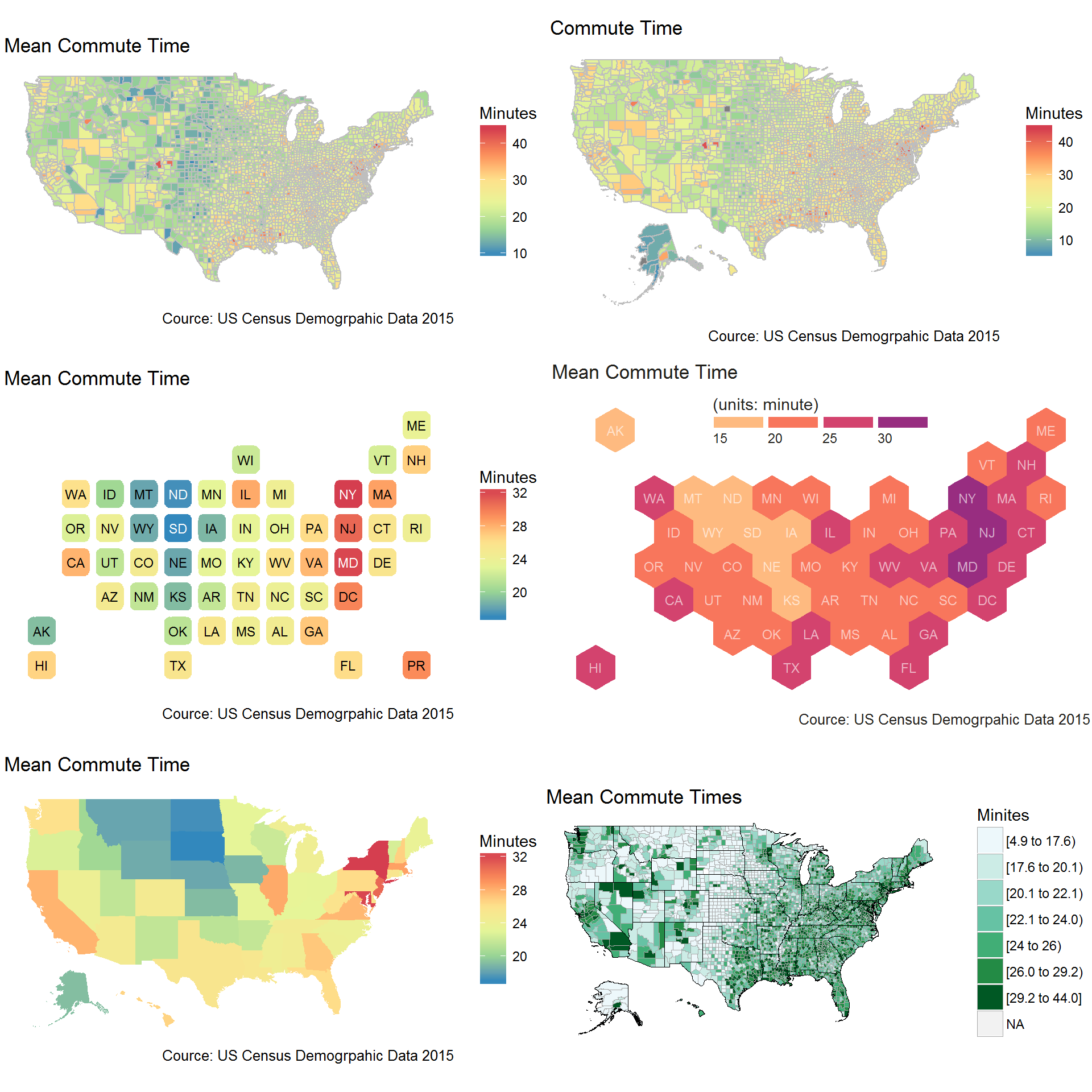
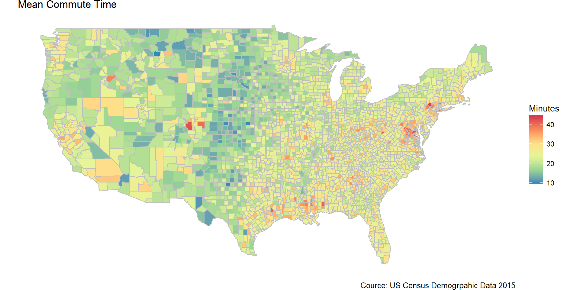
- Counties
- Map data from
mpas- Corrected to match with American Community Survey (ACS)
- COUNS (48 states an DC)
- Corrected to match with American Community Survey (ACS)
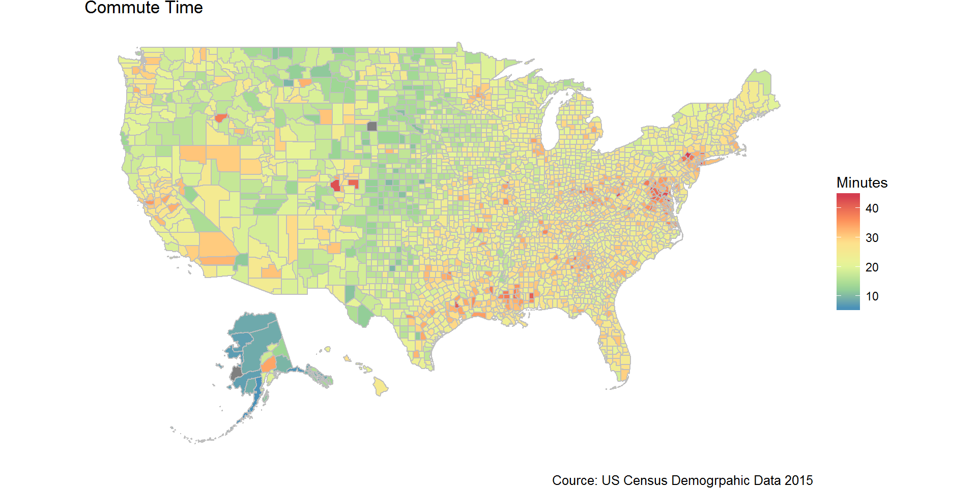
- Map data from
albersusa- 50 States and DC
- Using
R6classchoroplethr- 50 States and DC
- 50 States and DC
- Map data from
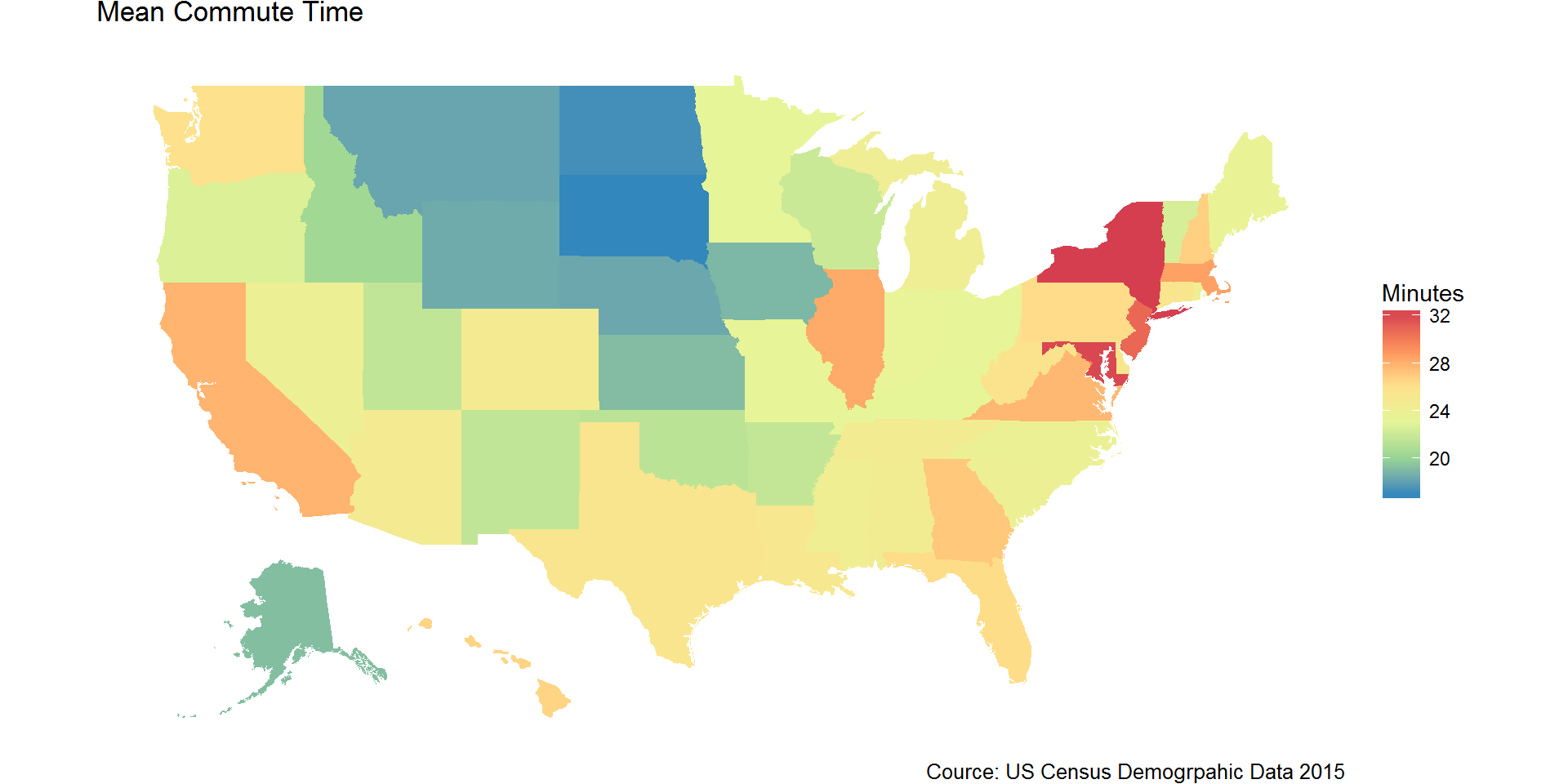
- States
- Map data from
fiftyster- 50 States and DC
- 50 States and DC
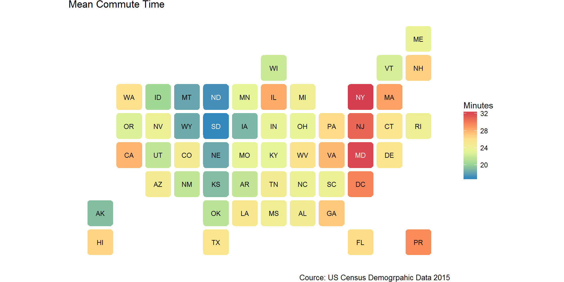
- State bins from
statebins- 50 States, DC and PR
- 50 States, DC and PR
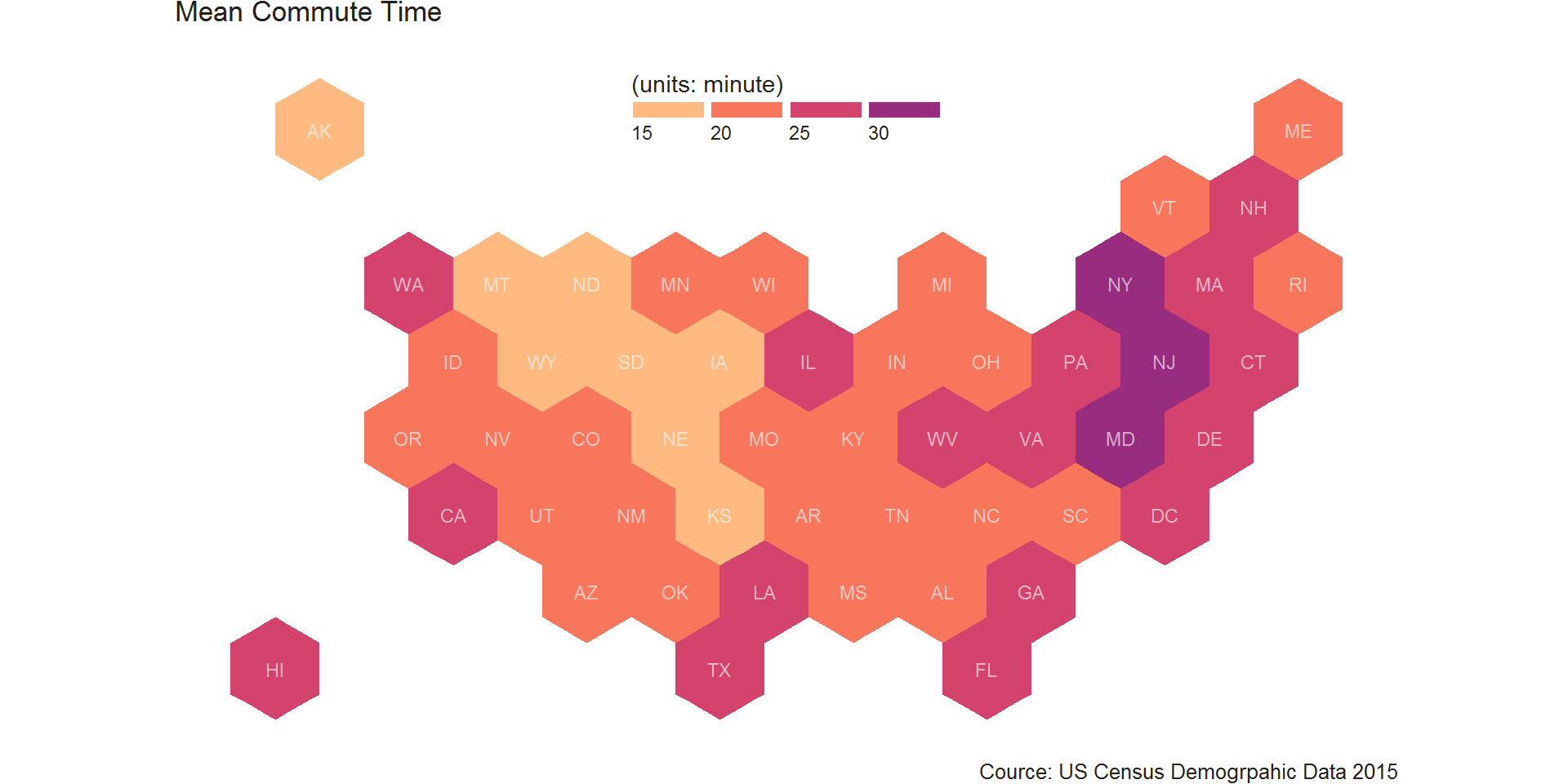
- State hexbins from
geojsonion- 50 States and DC
- Map data from
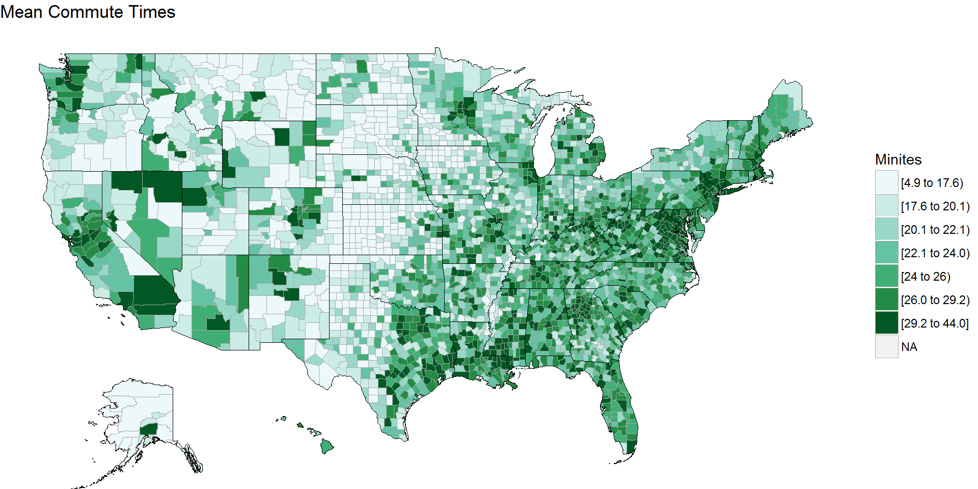
Week 5 - County-level American Community Survey (5-year estimates) 2015
Counties of CONUS with data from maps
 ### Counties of 50 States and DC with data from
 albersusa
Counties of 50 States and DC using choroplethr
50 States and DC using fiftyster
Bins of 50 States, DC and PR using statebins
Hexbins of 50 States and DC data from geojsonion